How can guides offer quick solutions while still providing comprehensive detail?

In the fast-paced digital world, users often seek immediate answers to their problems. However, for many tasks, a quick fix isn’t enough; they require a thorough understanding to truly resolve an issue or master a skill. This presents a unique challenge for guide creators: how do you balance the need for swift solutions with the necessity of providing comprehensive, in-depth information?
The Dual Challenge: Speed and Depth
The core tension lies in divergent user needs. Some users are in crisis, needing a single step to fix an error and move on. Others are learners, seeking to understand the ‘why’ behind each step, explore alternative methods, or troubleshoot potential pitfalls. A guide that is too dense can overwhelm the former, while one that is too superficial frustrates the latter.
Striking this balance is crucial for a guide’s utility and user satisfaction. A successful guide empowers users to choose their own path, whether they need a rapid resolution or a deep dive into the subject matter.

Strategies for Prioritizing Quick Solutions
To cater to users seeking immediate answers, guides should adopt several design and content strategies:
- Executive Summaries/TL;DR: Begin each major section or the entire guide with a concise summary of the key takeaways or the direct solution.
- Clear Headings and Table of Contents: Use descriptive headings and a navigable table of contents to allow users to quickly scan and jump to relevant sections.
- Step-by-Step Instructions: Present core solutions as simple, numbered steps, possibly in a distinct visual block.
- Visual Aids: Incorporate screenshots, diagrams, or short videos that visually demonstrate the solution, reducing the need to read extensive text.
- Highlighting Key Information: Use bold text, call-out boxes, or icons to emphasize critical warnings, essential steps, or direct answers.
These elements serve as an ‘express lane’ for users who just want to get the job done without wading through extensive explanations.

Weaving in Comprehensive Detail Gracefully
Once the quick solution is presented, the guide can then offer layers of detail for those who need it. This can be achieved through:
- Context and Background: Provide introductory paragraphs that explain the purpose of the task or the underlying principles, but keep these separate from the immediate steps.
- “Why” Explanations: After a step, offer a brief explanation of *why* that step is necessary or what it achieves. This transforms instruction into understanding.
- Troubleshooting Sections: Dedicate specific sections to common issues, error messages, and their corresponding solutions.
- Alternative Methods: If there are multiple ways to achieve a goal, present the most common first, then detail alternatives.
- Advanced Tips and Best Practices: For users who have mastered the basics, offer additional advice to optimize their workflow or delve deeper into the subject.
- Glossaries and Definitions: Explain technical jargon or unfamiliar terms either inline or in a dedicated section.
The key is to present this detail in an organized manner, making it easily accessible but not mandatory for initial problem-solving.
Structural Approaches for Harmonious Integration
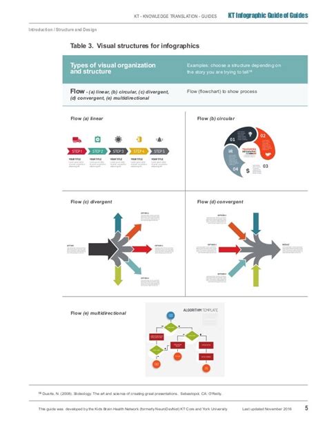
The architecture of the guide is paramount in integrating quick solutions with detailed information. Consider these structural models:
- Layered Information Design: Start with an overview, then drill down into increasing levels of detail. Think of it like an inverted pyramid where the most crucial information is at the top.
- Expandable Sections (Accordions/Toggles): Use interactive elements that hide detailed explanations until a user actively chooses to reveal them. This keeps the initial view clean.
- Internal Hyperlinking: Refer to other sections within the guide for more detail, troubleshooting, or related topics. This creates a non-linear reading experience, allowing users to navigate based on their specific needs.
- Sidebars/Call-out Boxes for Deeper Dives: Use visually distinct containers for supplementary information that isn’t central to the main flow but adds value for interested readers.
By employing these structures, guides can present a lean, actionable path initially, with pathways to richer content readily available.

Best Practices for Implementation
To successfully implement this dual approach, keep the following best practices in mind:
- Know Your Audience: Understand their prior knowledge, their goals, and their common pain points. This informs what counts as a ‘quick solution’ and what level of ‘detail’ is needed.
- Clear Hierarchy: Use consistent formatting, font sizes, and indentation to clearly differentiate between main steps, explanations, warnings, and supplementary information.
- Concise Language: Even when providing detail, strive for clarity and conciseness. Avoid jargon where possible, or explain it immediately.
- Regular Testing and Feedback: Observe how users interact with your guide. Do they find quick solutions easily? Do they know where to look for more detail? Adjust based on their feedback.
Ultimately, a truly effective guide respects the user’s time and intelligence. It provides immediate answers when they’re needed most, while simultaneously building a robust foundation of knowledge for those who wish to explore further. By mastering the art of layering information and designing for diverse user intentions, guide creators can craft resources that are both efficient and profoundly informative.


