
What’s the optimal guide format for quick mobile answers without spoilers?
The Mobile Dilemma: Speed, Spoilers, and Solutions
In the fast-paced world of mobile gaming and on-the-go information retrieval, users demand quick, precise answers without wading through verbose guides or encountering unwanted plot revelations. Traditional lengthy walkthroughs, designed for desktop consumption, often fail on smaller screens, leading to frustration and dropped engagement. The challenge lies in distilling complex information into an easily digestible, spoiler-free format that respects the user’s time and mobile context. This article explores optimal guide structures that prioritize immediacy and user experience.
Pillars of an Effective Spoiler-Free Mobile Guide
Crafting a superior mobile guide hinges on a few core principles. First, conciseness is king. Every word must serve a purpose, getting straight to the point. Second, discoverability is crucial; users should find what they need in seconds, not minutes. This means intuitive navigation and powerful search functionalities. Third, spoiler control must be baked into the design, allowing users to reveal information only when ready. Finally, accessibility ensures the guide is usable by everyone, regardless of device or ability.
Consider the user’s intent: Are they stuck on a specific puzzle? Looking for an item location? Or simply clarifying a game mechanic? The guide must anticipate these needs and provide direct access to the answer.
Recommended Formats for Instant, Spoiler-Free Answers
Several guide formats excel in delivering quick mobile answers while mitigating spoiler risks:
- FAQ/Q&A Structure: This is arguably the most straightforward. Users often phrase their queries as questions. Presenting answers directly beneath clear, concise questions allows for rapid scanning and targeted information retrieval. Each answer should be brief, and follow-up details can be hidden behind an expandable ‘show more’ button.
- Interactive Checklists/Progress Trackers: For progression-based guides, a checklist allows users to mark off completed steps. This gives a sense of accomplishment and clarity on what’s next, without revealing future plot points unless explicitly clicked.
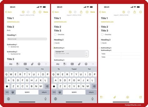
- Collapsible Sections (Accordions): Ideal for segmenting information. Each section title (e.g., “Chapter 3: The Forest Path”) can be clicked to reveal its content. This keeps the initial view clean and prevents accidental spoilers. Within these sections, further sub-sections can also be collapsible.
- Contextual Hints System: Instead of full solutions, offer a tiered hint system. A first click reveals a subtle nudge, a second click provides more detail, and a third gives the full answer. This empowers the user to choose their level of assistance.
- Visual Guides with Minimal Text: For location-based queries or puzzles, annotated screenshots or short video clips can convey information much faster than paragraphs of text. Ensure images are optimized for mobile loading speed.

Key Design Elements for User-Centric Mobile Guides
Beyond the structural format, specific design elements enhance the user experience:
- Robust Search Functionality: A prominent, fast search bar is indispensable. It should support partial matches and suggest common queries.
- Clear Labeling and Iconography: Use universally understood icons and unambiguous headings. Avoid jargon where possible.
- Responsive Design: Essential for seamless viewing across all mobile devices, ensuring text is readable and interactive elements are tappable.
- Lazy Loading and Performance Optimization: Large guides can be slow. Implement lazy loading for images and content sections to improve initial load times.
- “Spoil Me” Option: For those who do want full spoilers, offer a clear, opt-in button or toggle to reveal all hidden content.

Implementing these strategies means building a mobile guide that respects the user’s time and desire for a spoiler-free experience. By focusing on concise, easily discoverable, and interactively controlled content, creators can deliver optimal assistance right when and where it’s needed, transforming frustration into fluid progression. The ultimate goal is to empower users, not overwhelm them, allowing them to extract specific answers with minimal effort.