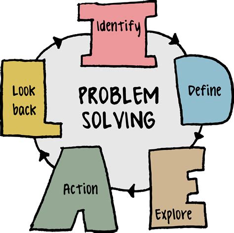


How to make guides scannable for quick task completion?
In today’s fast-paced digital world, users rarely read content word-for-word. Instead, they scan for keywords, headings, and visual cues to quickly extract the information they need. For guides, this behavior means that scannability isn’t just a nicety—it’s a critical component for ensuring quick task completion and a positive user experience. A well-structured, scannable guide reduces frustration, saves time, and significantly improves the likelihood of users successfully completing their goals.
The Imperative of Scannability in Modern Guides
Think about how you use a guide when you’re trying to fix a problem or learn a new process. You’re likely looking for a specific step or solution, not a narrative. If a guide is a dense block of text, users will struggle to find what they need, leading to abandonment or errors. Scannability is about making the most important information jump out, guiding the user’s eye directly to the relevant details without unnecessary cognitive load.
By optimizing your guides for scannability, you’re not just making them easier to read; you’re making them more effective tools for your audience. This approach directly translates to quicker task completion, higher user satisfaction, and reduced support queries.
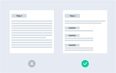
Leveraging Headings and Subheadings
One of the most powerful tools for scannability is a clear, hierarchical heading structure. Headings (H2, H3, H4) act as signposts, breaking down complex topics into digestible sections and allowing users to navigate quickly to the part of the guide most relevant to their current need. Use descriptive, benefit-oriented headings that clearly state what each section covers.
For example, instead of a generic “Introduction,” use “Understanding the Basics of X.” For a process step, “Setting Up Your Account” is far more useful than “Step 1.” A logical flow of headings creates an intuitive roadmap for the user.

Mastering Lists: Bullet Points and Numbered Steps
Lists are indispensable for presenting information in a scannable format. Bullet points are ideal for features, benefits, or collections of related items that don’t require a specific order. Numbered lists, conversely, are perfect for step-by-step instructions where the sequence is critical for task completion. Both formats break up large paragraphs and make information visually distinct.
- Use bullet points for: Key takeaways, feature lists, advantages, prerequisites.
- Use numbered lists for: Step-by-step procedures, sequential actions, ordered instructions.
Ensure that each list item is concise and focuses on a single point or action, making it easy for users to process quickly.
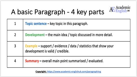
Writing Concisely and Structuring Short Paragraphs
Long, sprawling paragraphs are the enemy of scannability. Aim for brevity and clarity in your writing. Get straight to the point, use active voice, and eliminate jargon where possible. Each paragraph should ideally convey one main idea or a single logical thought. Keep sentences relatively short and focus on precision.
Breaking down information into smaller, digestible chunks makes it less intimidating and easier to scan. If a paragraph extends beyond three or four sentences, consider if it can be broken into multiple paragraphs, converted into a list, or simplified.
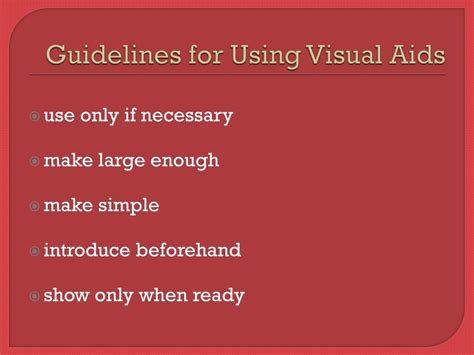
Strategic Use of Visual Aids and Bolding
Visual elements like screenshots, diagrams, flowcharts, and embedded videos can communicate complex information far more effectively and rapidly than text alone. They act as powerful anchors, drawing the user’s eye and providing immediate context or demonstration for a particular step or concept. Always ensure visuals are relevant, high-quality, and annotated if necessary.
Similarly, strategic use of bolding can highlight critical terms, actions, or warnings. Use bolding sparingly to avoid diminishing its impact. It should guide the reader to the most important elements within a sentence or paragraph, such as specific button names, menu options, or crucial commands.
Ensuring Consistent Formatting and Terminology
Consistency is key to reducing cognitive load. Use the same font styles, colors (if applicable), and spacing throughout your guides. More importantly, maintain consistent terminology. If you refer to a “dashboard” in one section, don’t call it a “control panel” in another. This predictability allows users to build mental models quickly and confidently navigate the information.
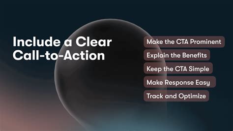
Actionable Language and Clear Calls to Action
When guiding users through a process, use strong, actionable verbs at the beginning of sentences and steps. Instead of “The user should click the button,” write “Click the ‘Submit’ button.” Make sure every instruction is unambiguous, telling the user exactly what to do and what outcome to expect.
Clear calls to action remove guesswork and propel the user forward efficiently. Avoid passive voice and hedging language that can create confusion or hesitation.
Testing for Scannability
The ultimate test of a guide’s scannability is how real users interact with it. Conduct user testing to observe where users get stuck, what they skip, and how quickly they find crucial information. A simple “squint test” can also be effective: squint your eyes at the guide. What stands out? Are the most important elements still visible? This can help you identify areas where formatting or emphasis is lacking.
Conclusion
Making guides scannable isn’t just about aesthetics; it’s about functionality and user empowerment. By consciously applying principles of clear structure, concise language, strategic formatting, and visual support, you transform your guides from mere information repositories into highly efficient tools for quick task completion. Invest in scannability, and you invest in your users’ success and satisfaction.