

Best practices for designing gaming walkthroughs for multi-screen use (PC, mobile) mid-game?

The Evolving Landscape of Player Support
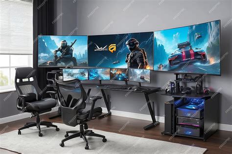
In today’s dynamic gaming environment, players often engage with titles across multiple devices – a powerful PC at home, a mobile phone on the go. This cross-platform engagement extends beyond just gameplay; it increasingly influences how players seek assistance. Designing mid-game walkthroughs that cater to both PC and mobile users simultaneously presents unique challenges and opportunities. The goal isn’t just to provide answers, but to deliver them contextually, accessibly, and without breaking immersion, regardless of the screen a player is looking at.
Effective multi-screen walkthrough design acknowledges that a player might be actively gaming on one device while consulting a guide on another, or even pausing play to switch to a smaller screen for quick reference. This paradigm shift demands a thoughtful approach to information architecture, user interface, and overall user experience.
Core Principles for Multi-Screen Walkthroughs
Responsive & Adaptive Design
The foundation of any successful multi-screen strategy is responsiveness. Walkthroughs must seamlessly adapt their layout, content, and interactive elements to fit screen sizes ranging from large PC monitors to compact mobile displays. This isn’t merely about scaling; it’s about optimizing the experience. On PC, more information might be displayed simultaneously, while on mobile, content needs to be highly scannable, perhaps using accordions or tabbed navigation to conserve screen real estate.
Conciseness & Clarity
Mid-game assistance implies a player is stuck and seeking a quick solution. Walkthroughs should prioritize clear, concise, and direct answers. Avoid lengthy narrative passages for critical information. Use bullet points, bold text, and visual cues to highlight key steps. On mobile, this becomes even more critical due to limited screen space and often, shorter attention spans.
Contextual Delivery
The best walkthroughs don’t just provide answers; they anticipate questions. Integrations that can detect a player’s current game state (e.g., via companion apps or API links) can offer highly relevant, spoiler-free advice. For instance, if a player is in a specific quest area, the walkthrough could automatically filter to relevant tips for that objective, minimizing navigation time.

Strategic Implementation Techniques
External Companion Apps or Websites
Often the most flexible approach, a dedicated companion app or a responsive website allows players to consult walkthroughs on a separate device without interrupting their gameplay. This method provides ample screen real estate for detailed guides, interactive maps, or video clips. Deep linking from in-game prompts to specific sections of the external guide can provide a seamless transition.
In-Game Overlays (PC) & Deep Links (Mobile)
For PC players, a non-intrusive overlay or picture-in-picture (PiP) window can display walkthrough content directly within the game without forcing a full alt-tab. On mobile, direct integration is harder due to screen constraints. Instead, deep links that open a browser or companion app to a specific guide section are more practical, allowing players to quickly switch, get their answer, and switch back.
Interactive Checklists & Progress Tracking
Enhance engagement by incorporating interactive elements. Checklists for collectibles, quest steps, or crafting recipes allow players to mark off progress, feeling a sense of accomplishment. If the walkthrough can sync with game data (again, via companion apps), it can even auto-update progress, providing a persistent, personalized guide across all screens.
Optimizing for PC and Mobile Distinctly
While responsive design is key, understanding the distinct usage patterns of PC and mobile players is crucial. PC users might prefer detailed text, keyboard shortcuts for navigation, and potentially multiple guide windows. Mobile users, conversely, need touch-friendly interfaces, minimal scrolling, quick-load times, and ideally, content optimized for quick glances rather than deep dives.
Consider offering different content formats or levels of detail. A PC walkthrough might include extensive lore or strategic deep-dives, while the mobile version might prioritize bulleted steps and immediate objectives. Ensure media like images and videos are optimized for both bandwidth and screen size.
Testing, Feedback, and Iteration
No design is perfect from the outset. Rigorous testing with real players on various devices is essential. Monitor analytics to see which sections are most visited, where players drop off, and what search terms they use. Gather direct feedback on ease of use, clarity, and overall helpfulness. Use this data to continually refine the walkthroughs, ensuring they remain relevant and effective as the game evolves.

Conclusion
Designing effective multi-screen mid-game walkthroughs is no longer an optional luxury but a necessity for enhancing player experience in a cross-platform world. By focusing on responsive design, conciseness, contextual delivery, and smart implementation strategies, developers and content creators can provide invaluable support that empowers players to overcome challenges and fully immerse themselves in their favorite games, no matter which screen they choose.