
How do you balance depth vs. brevity in gaming walkthroughs for optimal user experience?

Creating an effective gaming walkthrough is a delicate balancing act. On one hand, players demand comprehensive information to overcome challenges, discover secrets, and achieve 100% completion. On the other, too much text can overwhelm, leading to players skimming or abandoning the guide altogether. The core challenge lies in delivering depth without sacrificing brevity, ensuring the optimal user experience.

Understanding Your Audience’s Needs
The first step in achieving this balance is to deeply understand the diverse needs of your audience. Not all players use walkthroughs for the same reason. A casual player might only need a quick hint for a tricky boss, while a completionist seeks every collectible, side quest, and lore detail. Speedrunners, conversely, might require precise, frame-perfect instructions for optimal routes.
Tailoring your walkthrough means recognizing these different user profiles. A single guide might not perfectly serve everyone, but a well-structured one can offer pathways for each type of player to find what they need efficiently.

Strategies for Delivering Depth with Brevity
Modular and Layered Information
One of the most effective techniques is to present information in a modular, layered fashion. Start with a concise overview or a quick-start guide, then offer more granular details for those who need them. This can be achieved through:
- Summary Boxes: Quick tips or essential steps highlighted at the beginning of a section.
- Expandable Sections: Using “click to reveal” elements for optional lore, advanced strategies, or spoiler content.
- Internal Links: Guiding users to dedicated pages or sections for specific side quests, collectible locations, or character builds, keeping the main path clean.
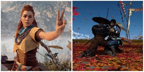
Leveraging Visuals and Multimedia
A picture is worth a thousand words, and a short video even more. Integrating screenshots, annotated maps, GIFs, and short video clips can convey complex information far more efficiently than text alone. Visual aids are excellent for:
- Showing exact puzzle solutions or item locations.
- Illustrating combat mechanics or boss attack patterns.
- Highlighting specific environmental details or hidden paths.
Ensure visuals are high-quality, clearly labeled, and directly relevant to the surrounding text, allowing players to grasp concepts quickly without reading lengthy descriptions.

Prioritizing Key Information and Concise Language
Focus on the critical path first. What does a player absolutely need to know to progress? Optional content, side quests, and deep lore should be clearly marked as such or relegated to separate sections. When writing, use clear, direct, and concise language. Avoid jargon where simpler terms suffice, and break down complex instructions into manageable, numbered steps.
Tailoring for Specific Game Genres
The optimal balance also varies significantly by game genre. An RPG walkthrough might require extensive detail on character builds, quest choices, and narrative implications. In contrast, a puzzle game walkthrough might only offer subtle hints to avoid spoiling the core gameplay experience, reserving full solutions for a separate, clearly marked section.
Consider the nature of the game and what players typically seek in a guide for that genre. A narrative-driven game might benefit from spoiler warnings and options to reveal plot details, while an open-world game needs robust mapping and collectible tracking.

Conclusion
Ultimately, balancing depth and brevity in gaming walkthroughs is an ongoing process of iteration and user feedback. The goal isn’t just to provide answers, but to empower players to enjoy their gaming journey without unnecessary frustration or overwhelming information overload. By understanding your audience, structuring content intelligently, and harnessing the power of visuals, walkthrough creators can craft guides that are both comprehensive and a joy to use, enhancing the overall gaming experience for everyone.