

How to format long game guides for quick, easy readability on mobile devices?
Long game guides are invaluable resources, but their extensive detail can become a barrier when accessed on smaller mobile screens. Ensuring these guides are quick and easy to read on smartphones and tablets is crucial for player engagement and comprehension. This article explores key formatting strategies and HTML techniques to transform dense information into a mobile-friendly experience, allowing players to find critical information without endless scrolling or squinting.
Why Mobile Readability is Non-Negotiable
In today’s gaming landscape, a significant portion of players access information on the go. A poorly formatted guide leads to frustration, abandonment, and ultimately, a less helpful resource. Prioritizing mobile readability means players can quickly scan, digest, and act upon the information, whether they’re looking up a boss strategy during a commute or checking an item location mid-game. Optimizing for mobile isn’t just a convenience; it’s a necessity for accessibility and user satisfaction.
Core Principles for Mobile-Friendly Guides
Break Up Text with Headings and Subheadings
The most fundamental rule for mobile readability is to avoid large blocks of text. Use <h2>, <h3>, and <h4> tags to divide your guide into digestible sections. Each heading should clearly indicate the content that follows, allowing users to quickly scan and jump to relevant parts. This creates a clear hierarchy and mental map for the reader.
For instance, instead of one long “Quest Walkthrough” section, break it down into “Quest Start,” “Objective 1: Find NPC,” “Objective 2: Gather Items,” “Boss Fight Strategy,” and “Quest Completion.” This segmented approach greatly reduces cognitive load.
Embrace Short Paragraphs and Bullet Points
On a small screen, lengthy paragraphs become intimidating walls of text. Keep paragraphs concise, ideally 2-4 sentences long. When presenting lists of items, steps, or features, always opt for <ul> (unordered lists) or <ol> (ordered lists). Lists are inherently easy to scan and digest, making complex information much more manageable.
Use strong emphasis (<strong> tags) sparingly for key terms or warnings, but don’t overuse it to avoid visual clutter.
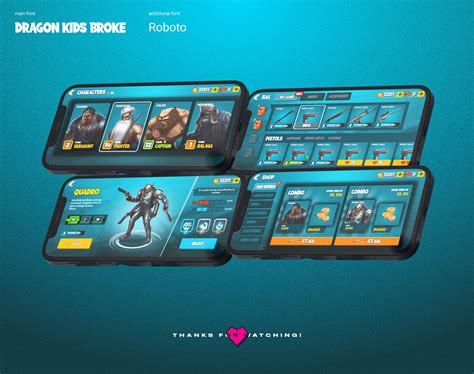
Utilize Responsive Images and Media
Images, maps, and diagrams are crucial for game guides. However, they must be responsive. Ensure your HTML and CSS settings allow images to scale down to fit the screen width without overflowing or distorting. Ideally, images should complement the text, not replace it entirely, and include descriptive alt attributes for accessibility and context. Avoid excessively large image file sizes to ensure quick loading times on mobile networks.
Implement Collapsible Sections for Details
For extremely long sections or optional deep dives (like lore explanations, advanced statistics, or exhaustive item lists), consider using interactive collapsible elements (often achieved with <details> and <summary> tags, or JavaScript toggles). This allows users to see an overview and expand only the sections they wish to read, reducing initial scroll fatigue.
Keep the summary text clear and concise so users know exactly what they’ll find inside the expanded content.
Choose Legible Fonts and Optimal Line Spacing
Font choice and typography are paramount. Opt for clean, sans-serif fonts that are easy to read at smaller sizes. Ensure sufficient font size (typically 16px or more for body text) and adequate line height (around 1.5-1.6em) to prevent lines from blending together. Ample white space around text and elements also improves visual comfort.
Optimize Tables and Data Displays
Tables, especially those with many columns, are notoriously difficult on mobile. For simple tables, ensure they are responsive (e.g., using CSS to allow horizontal scrolling or converting columns to rows on smaller screens). For complex data, consider alternatives like converting tables into structured lists, using card layouts, or providing downloadable CSVs. Prioritize the most critical data points.
Practical HTML and CSS Tips
- Use Semantic HTML: Employ
<header>,<nav>,<main>,<article>,<section>,<footer>tags to structure your document logically. - Viewport Meta Tag: Always include
<meta name="viewport" content="width=device-width, initial-scale=1.0">in your<head>to ensure proper scaling. - CSS Media Queries: Use media queries to apply different styles (e.g., font sizes, column layouts) based on screen width.
- Flexbox/Grid for Layout: Leverage CSS Flexbox or Grid for creating responsive layouts that adapt gracefully to various screen sizes.
- Minimalist Design: Avoid excessive styling, complex backgrounds, or small interactive elements that are difficult to tap.

Testing and Iteration
The best way to ensure mobile readability is to test frequently on actual mobile devices. Use browser developer tools to simulate different screen sizes, but also check on a variety of smartphones and tablets. Gather feedback from users. Mobile optimization is an ongoing process; be prepared to iterate and refine your formatting based on real-world usage.
Conclusion
Transforming long game guides for quick, easy readability on mobile devices requires a thoughtful approach to structure, content presentation, and technical implementation. By breaking down information, utilizing responsive elements, and prioritizing clear typography, you can create guides that are not just comprehensive but also a joy to use for every player, regardless of their device. Investing in mobile-friendly formatting ensures your valuable guides remain accessible and effective in the palm of every gamer’s hand.