In the fast-paced world of mobile gaming, players often need information quickly and efficiently. Traditional, long-form gaming guides designed for desktop screens can be cumbersome and frustrating to navigate on a smartphone. Optimizing your guide’s structure for mobile readability and quick answers isn’t just a nicety; it’s a necessity for user satisfaction and engagement.
Understanding the Mobile User’s Needs
Mobile gamers are typically looking for specific solutions: how to beat a boss, find a hidden item, or solve a puzzle. They are often playing concurrently, meaning they need answers at a glance without having to scroll endlessly or dig through irrelevant text. Limited screen real estate, touch navigation, and potential distractions demand a highly streamlined and scannable format.
Core Principles for Mobile-First Guide Design
1. Chunking Information into Bite-Sized Sections
Break down your guide into the smallest logical units possible. Instead of sprawling paragraphs, use short, concise sentences and bullet points. Each section should address a single query or topic. This makes the guide less overwhelming and easier to digest on a small screen. Think in terms of micro-sections, each with a clear heading.
2. Prioritize Essential Information Upfront
Don’t bury the lead. If a guide is about beating a specific boss, the strategy should be immediately accessible. Provide a quick summary or a step-by-step checklist at the beginning of relevant sections, followed by more detailed explanations for those who need them. This ‘inverted pyramid’ approach is crucial for quick answers.
3. Strategic Use of Headings and Subheadings
Employ a clear hierarchical structure using `
`, `
`, and `
` tags. These act as signposts, allowing users to quickly scan and jump to the section they need. Use descriptive and action-oriented headings that clearly indicate the content below.
Enhancing Readability and Navigation
1. Visual Cues and Formatting
Bold Text: Highlight keywords, item names, and crucial instructions.
Bullet Points and Numbered Lists: Essential for step-by-step instructions or listing items.
Short Paragraphs: Aim for 2-4 sentences per paragraph to avoid large blocks of text.
Whitespace: Generous use of whitespace improves visual comfort and scannability.
2. Interactive and Navigational Elements
While not always possible, consider features like a sticky table of contents (TOC) for longer guides, allowing users to quickly jump between major sections. Anchor links within the text can also help users navigate to specific points. A search bar within the guide or site can be invaluable for pinpointing specific keywords.
3. Optimizing Images and Media
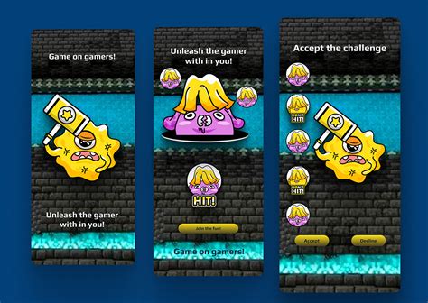
If you include images or short video clips, ensure they are mobile-optimized (fast loading, responsive). Use them sparingly and strategically to illustrate a point, rather than as decorative elements that add to load time. Clearly caption all media.
Practical Implementation Strategies
When creating or adapting guides:
Focus on a single topic per page/section: If a guide covers multiple quests, consider separate pages or very distinct, well-linked sections.
Use a Question-and-Answer format: Frame headings as questions the user might ask (e.g., “How to Defeat X Boss?”, “Where to Find Y Item?”).
Provide clear calls to action: Guide users to the next step, whether it’s another section of the guide or an external resource.
Testing and Iteration
The best way to ensure your guide is mobile-friendly is to test it on various mobile devices. Pay attention to load times, navigation ease, and how quickly you can find specific information. Gather feedback from users and iterate on your design. Continuous improvement based on user behavior is key to creating truly optimized gaming guides.
By adopting a mobile-first mindset and implementing these structural and design principles, you can transform your gaming guides into highly effective tools that genuinely assist players, enhancing their overall gaming experience on the go.