In the fast-paced world of mobile gaming, players often need information quickly and efficiently. A poorly structured game guide on a small screen can be frustrating, leading to abandoned searches and a poor user experience. Crafting guides specifically for mobile devices requires a deliberate approach to content organization, visual hierarchy, and user-centric design. This article will explore key strategies to ensure your game guides are not only readable but also allow for lightning-fast information retrieval on any mobile device.
The Mobile Challenge: Why Traditional Guides Fall Short
Traditional game guides, often designed for larger desktop screens, struggle when squeezed onto a smartphone. Lengthy paragraphs, complex layouts, and dense information blocks become overwhelming and difficult to navigate. Mobile users have limited screen real estate, shorter attention spans, and often access guides while actively playing the game, demanding immediate answers without endless scrolling or zooming.
Core Principles for Mobile-Optimized Game Guides
1. Prioritize Conciseness and Scannability
Every word counts on mobile. Break down information into bite-sized chunks. Use short sentences and even shorter paragraphs (1-3 sentences). Embrace bullet points and numbered lists to present steps, items, or requirements clearly. This allows users to quickly scan for the information they need without getting lost in dense text.
2. Implement Clear and Hierarchical Headings
Headings (`
`, `
`, `
`) are your user’s best friends on mobile. They act as signposts, allowing players to quickly identify sections relevant to their current query. Ensure headings are descriptive and consistent. For instance, instead of just “Chapter 1,” use “Chapter 1: The Forsaken Temple Quest Walkthrough.” Use `
` for subsections within a major `
` topic.
3. Leverage Visual Cues and Formatting
Beyond headings, use other formatting elements to draw attention to critical information. Bold important terms, rewards, or warnings. Use blockquotes or distinct call-out boxes (if your platform supports it) for tips, warnings, or key takeaways. Ensure sufficient line spacing and paragraph breaks to prevent text from feeling cramped.
4. Facilitate Quick Navigation with Tables of Contents and Internal Links
For longer guides, a sticky (always visible) table of contents on mobile can be invaluable. It allows users to jump directly to sections without endless scrolling. Additionally, strategic internal links within the content (e.g., linking an item name to its dedicated database entry) can significantly improve the user experience and retrieval speed.
Advanced Techniques for Enhanced Mobile UX
Interactive Elements (When Appropriate)
While often requiring more technical implementation, interactive elements can greatly enhance mobile guides. Collapsible sections (accordions) allow users to reveal information only when they need it, keeping the initial view clean and uncluttered. Tabs can organize different aspects of a topic (e.g., ‘Stats,’ ‘Skills,’ ‘Lore’ for a character).
Optimizing Images and Media
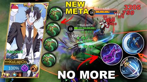
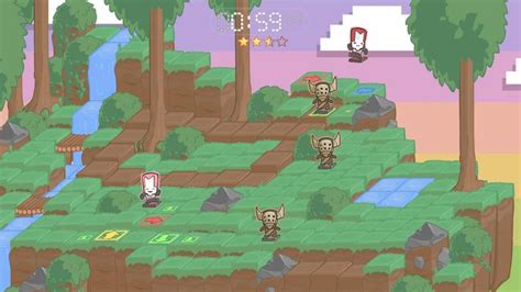
Images, screenshots, and short video clips can be incredibly helpful but must be optimized for mobile. Ensure images are responsive, load quickly, and are clearly annotated. Use image captions to provide context without forcing the user to read surrounding paragraphs. Avoid large, uncompressed media files that can slow down loading times, frustrating mobile users with limited data or slower connections.
Structuring Specific Guide Types for Mobile
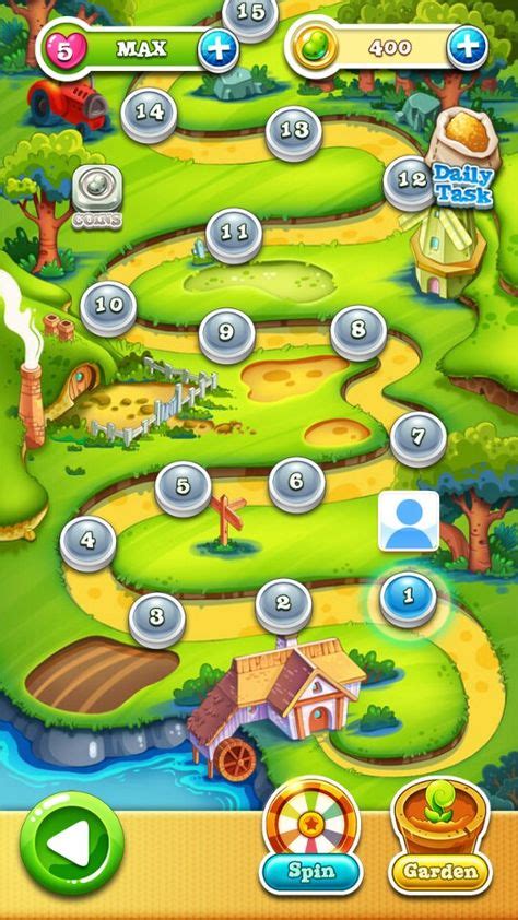
Walkthroughs: Step-by-Step Clarity
For sequential walkthroughs, clearly number each step. Break down complex actions into multiple, distinct steps. Use bolding for key actions (e.g., “Defeat the Shadow Beast“) and list necessary items or prerequisites at the beginning of each quest or section. Visual cues like simple icons can also differentiate quest objectives from optional tasks.
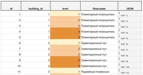
Databases & Item Lists: Accessible Information
When presenting tables of data (items, characters, spells), consider how they render on mobile. Responsive tables that stack columns or allow horizontal scrolling are essential. For very large datasets, implement search and filter functionalities to help users pinpoint specific information quickly. Each entry should ideally link to its own dedicated page for more detailed information.
Conclusion: A User-Centric Approach
Structuring game guides for optimal readability and quick information retrieval on mobile is not just about adapting existing content; it’s about adopting a mobile-first mindset. By prioritizing conciseness, clear hierarchy, effective formatting, and accessible navigation, guide creators can significantly enhance the user experience. Always test your guides on various mobile devices to catch potential pain points and ensure your players can find the help they need, when they need it, no matter where they are.