What essential formatting improves game guide readability & navigation?

What essential formatting improves game guide readability & navigation?

The Foundation: Clear Structure and Hierarchy

Creating a game guide that truly serves its audience hinges on a well-defined structure. Without clear organization, even the most accurate information can be lost in a sea of text. The use of strong headings and subheadings is paramount, acting as signposts that guide readers through complex content.

Headings and Subheadings

Employ `

` for major sections (e.g., “Early Game”, “Boss Strategies”, “Side Quests”) and `

` for subsections (e.g., “Chapter 1: The Beginning”, “Phase 1: Attack Patterns”, “Quest: The Lost Relic”). This hierarchical approach allows players to quickly scan and locate relevant information without having to read through large blocks of unrelated text. Consistent use of these elements creates a predictable and easy-to-follow flow.

Paragraphs and Line Spacing

Keep paragraphs concise, ideally focusing on a single idea. Break up long stretches of text into smaller, digestible chunks. Adequate line spacing (often referred to as leading in typography) is also vital, as it prevents text from feeling dense and overwhelming. A little white space goes a long way in making a guide inviting to read.

Platform Game Design – Dev.Mag

Enhancing Comprehension with Visuals & Emphasis

Beyond basic structure, certain formatting elements can highlight key information and make complex data easier to process, significantly boosting comprehension.

Lists (Bulleted and Numbered)

Bulleted lists (`

    `) are excellent for presenting unordered items like essential items, tips, or common enemy drops. Numbered lists (`
    `) are ideal for sequential instructions, steps in a quest, or ability upgrade paths. Both break up text and make information more scannable and digestible.

    Bold Text and Italics

    Judicious use of bold text (``) can draw attention to critical keywords, item names, character abilities, or warnings. Italics (``) can be used for lore snippets, spoken dialogue, or less critical but still important asides. Overuse, however, can dilute their impact and make the guide appear cluttered.

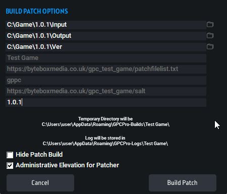
    Tables for Data Organization

    For presenting comparative data, statistics, crafting recipes, or character stats, HTML tables (`

    `) are indispensable. They organize complex information into an easily readable grid format, allowing players to quickly compare values or find specific details without sifting through paragraphs of text.

    Excel: How to Format Your Data in 60 Seconds

    Navigation at Your Fingertips

    A well-formatted guide isn’t just readable; it’s also easy to navigate. Players often jump around, looking for specific solutions, and robust navigation tools are key.

    Table of Contents (TOC)

    A dynamic Table of Contents, usually placed at the beginning, is perhaps the most powerful navigation tool. It provides an overview of the entire guide’s structure and allows readers to jump directly to any section with a click. For longer guides, a sticky or collapsible TOC can be incredibly user-friendly.

    Internal Linking

    Hyperlinking (``) within the guide allows authors to cross-reference related sections. For instance, linking an item name in a crafting guide to its acquisition location in a farming guide, or a boss name in a strategy section to a detailed enemy profile. This creates a seamless web of information, reducing the need for users to manually search for interconnected details.

    Interactive Navigation Menu in Framer (No-code tutorial) - YouTube

    Visual Aids: A Picture’s Worth a Thousand Words

    For game guides, visual elements are not just aesthetic; they are often crucial for clarity, especially when describing spatial or visual information.

    Screenshots and Diagrams

    Strategically placed screenshots can clarify complex instructions, show exact locations, illustrate puzzle solutions, or demonstrate specific combat mechanics. Diagrams (e.g., boss attack patterns, dungeon maps with marked paths) can convey information that is difficult or tedious to describe purely with text. Ensure images are relevant, clearly labeled (via alt text), and of good quality.

    8 Ways to Add Annotations to Your Screenshots in ScreenSteps [Video]

    Consistency is Key

    Finally, the overall impression of a professional and helpful guide comes down to consistency. Adhering to a uniform style throughout the guide builds trust and reduces cognitive load for the reader.

    Uniform Style and Layout

    Maintain consistent font choices, heading styles, color schemes (if applicable), and how you format specific elements (e.g., always bolding item names, always italicizing lore). A uniform layout across different sections makes the guide feel cohesive and polished, signaling attention to detail and a commitment to quality. This predictability allows players to focus on the content rather than being distracted by shifting presentation styles.

    By thoughtfully applying these essential formatting principles, guide writers can transform raw information into a highly readable, navigable, and ultimately invaluable resource for any gamer seeking assistance.

    Design Principles: Consistency. #graphicdesign #principles #consistency

Leave a Reply

Your email address will not be published. Required fields are marked *