

What formatting ensures a long game guide is easily scannable on mobile devices?

Creating a comprehensive game guide is an admirable endeavor, but its value diminishes if players can’t easily navigate it on their mobile devices. Given that a significant portion of online content consumption occurs on smartphones, optimizing long guides for scannability on smaller screens isn’t just a best practice—it’s essential for user engagement and retention. This article will explore the key formatting techniques that transform an intimidating block of text into an easily digestible resource for mobile users.
The Imperative of Mobile-First Scannability
Mobile users are often on the go, seeking quick answers or specific pieces of information. They don’t read; they scan. A poorly formatted long guide on a mobile device can feel overwhelming, leading to frustration and users abandoning the page in favor of more accessible alternatives. The goal is to break down complex information into bite-sized, digestible chunks that allow users to find what they need with minimal effort.

Core Formatting Principles for Mobile Guides
1. Clear, Hierarchical Headings
Headings are the backbone of scannable content. Use <h2> for major sections and <h3> for sub-sections. These act as signposts, guiding the reader through the guide’s structure and allowing them to quickly jump to relevant areas. Ensure headings are descriptive and accurately reflect the content that follows. A quick scan of headings should give a clear overview of the guide’s entire scope.
2. Concise Paragraphs and Sentences
On mobile screens, long paragraphs become an uninviting wall of text. Break down your content into short, focused paragraphs, ideally no more than 3-5 sentences each. Similarly, keep sentences direct and to the point. This reduces cognitive load and makes the text easier to process in small snippets.

3. Leverage Lists (Bullet Points & Numbered)
For steps, items, features, or any series of related points, use <ul> (unordered lists) and <ol> (ordered lists). Lists inherently draw the eye, break up text, and are highly scannable. Numbered lists are perfect for sequential steps (e.g., quest walkthroughs), while bullet points are ideal for features, tips, or non-sequential information.
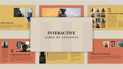
4. Implement an Interactive Table of Contents (TOC)
For truly long guides, an interactive Table of Contents at the top is invaluable. This acts as a navigational hub, allowing users to jump directly to any major section with a single tap. Use anchor links (<a href="#section-id">) to connect TOC entries to their respective headings (<h2 id="section-id">). This dramatically improves navigation and reduces endless scrolling.
5. Strategic Bolding and Text Emphasis
Use <strong> tags for keywords, critical information, or key takeaways within paragraphs. This draws the reader’s eye to the most important parts of a sentence or section. Avoid overdoing it, as too much bolding can negate its effect and make the text look cluttered. Use <em> for subtle emphasis where appropriate, but sparingly.
6. Optimize Image Placement and Description
Images can break up text and provide visual context, but they must be used thoughtfully on mobile. Ensure images are responsive and load quickly (though our src is empty, this is a real-world consideration). Place them strategically to complement the text, not interrupt it. Use descriptive alt attributes and consider captions (<figcaption>) within <figure> tags to provide additional context and enhance accessibility. Avoid placing vital text information within an image; always use text in the HTML.

7. Embrace Whitespace
Whitespace (empty space around text and images) is crucial for readability. It gives the eyes a place to rest and helps delineate different sections. Avoid cramming too much content into a small area. Proper use of headings, paragraphs, and lists naturally introduces whitespace, making the overall layout feel cleaner and less intimidating.

Conclusion: A User-Centric Approach
Ultimately, formatting a long game guide for mobile scannability is about prioritizing the user experience. By implementing clear headings, concise paragraphs, effective lists, an interactive TOC, strategic emphasis, and well-placed visuals, you transform a potentially overwhelming resource into an engaging and highly functional tool for any mobile gamer. These techniques not only improve usability but also demonstrate a commitment to your audience, ensuring your valuable guide reaches and assists as many players as possible.